How to Build React Applications Faster Using the Superbase UI Library with Shadcn Components
Priya Narayan
Systems Architect

Building modern React applications often involves implementing common UI patterns like authentication flows and file uploads. The new Superbase UI Library, built on top of Shadcn components, makes these implementations significantly easier for developers. In this tutorial, we'll explore how to integrate this powerful UI library into a Next.js application to quickly add authentication and file upload functionality.
Getting Started with Next.js and Shadcn
First, let's create a new Next.js application. While we're using Next.js in this tutorial, the Superbase UI Library works with any React-based application including Remix, React Router, or even vanilla React.
npx create-next-app@latest ui-library
cd ui-library
code .Once our project is created, we can start the development server to see the default Next.js landing page.
npm run dev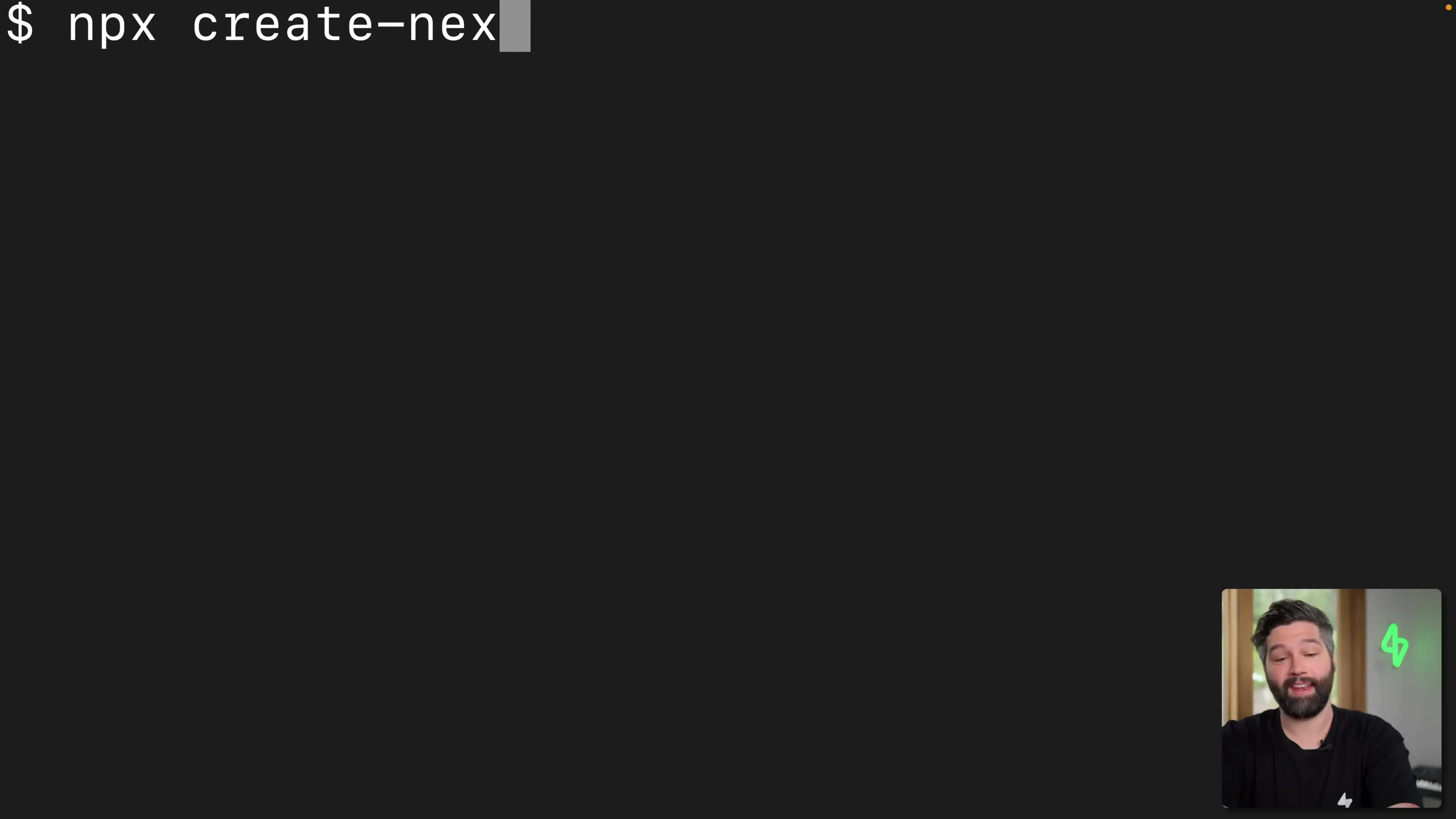
Before we can use the Superbase UI Library, we need to install Shadcn. Shadcn provides beautifully styled UI components with great UX and accessibility built-in, making it the perfect foundation for the Superbase UI Library.
npx shadcn-ui@latest initDuring the installation, select "neutral" as the base color. Since the latest version of Next.js uses React 19, we might encounter some peer dependency issues, so we'll use the `--force` flag to proceed with the installation.
Let's test our Shadcn installation by adding a button component:
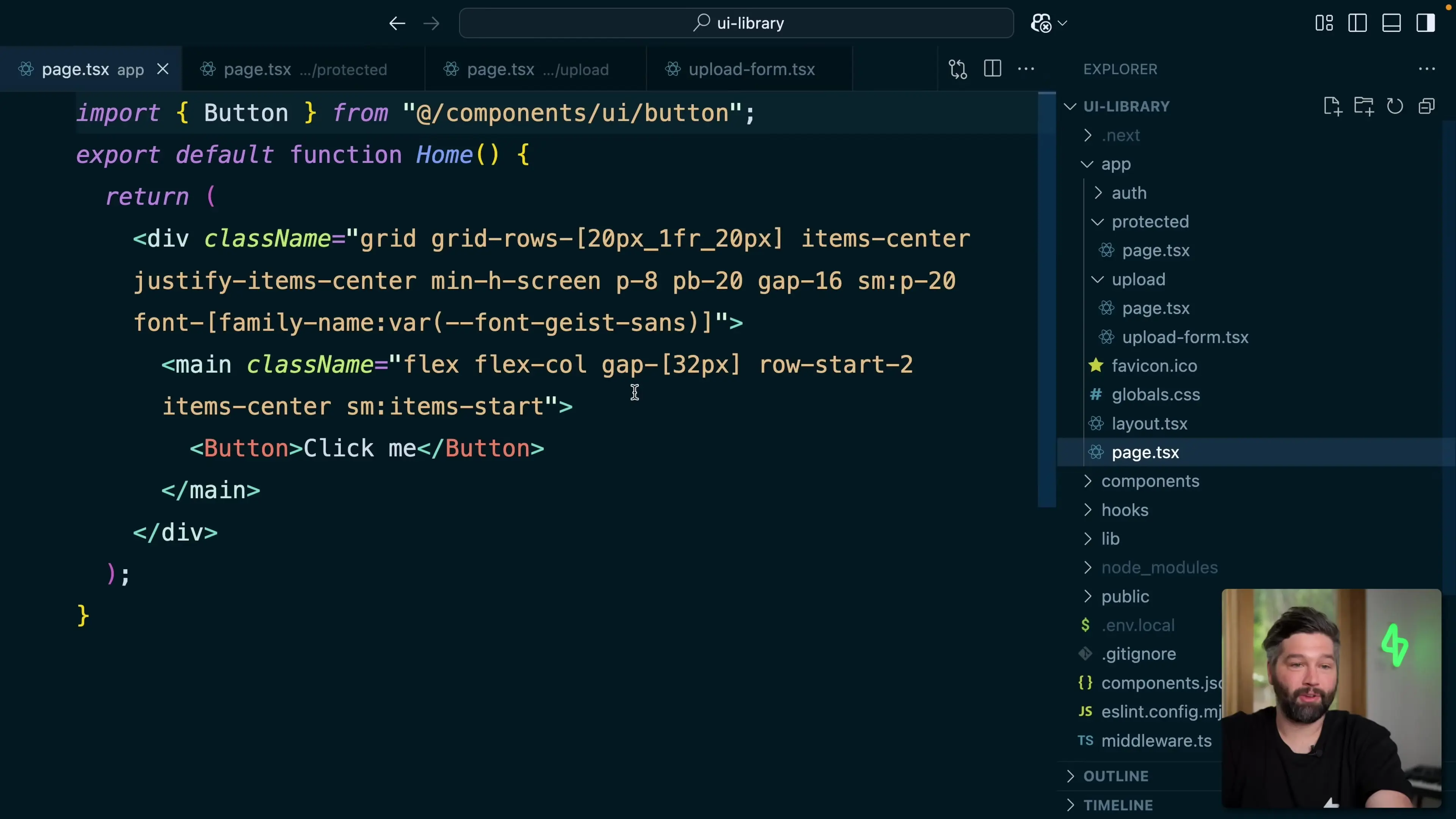
npx shadcn-ui@latest add button --forceNow, let's modify our page.tsx file to use the button component:
import { Button } from "@/components/ui/button"

export default function Home() {
  return (
    <div className="flex min-h-screen flex-col items-center justify-between p-24">
      <main className="flex flex-col items-center justify-between">
        <Button>Click me</Button>
      </main>
    </div>
  )
}To enable dark mode for a better visual experience, modify the layout.tsx file by adding the "dark" class to the body tag:
export default function RootLayout({ children }) {
  return (
    <html lang="en">
      <body className="dark">{children}</body>
    </html>
  )
}Installing the Superbase UI Library
Now that we have Shadcn set up, we can install the Superbase UI Library. This library provides pre-built components for common Superbase functionality like authentication.
npx supabase-ui-library@latest add auth --forceOne of the great features of both Shadcn and the Superbase UI Library is that the code for all components lives within your codebase. This means you can easily customize any component to fit your specific needs.
Connecting to Superbase
After installing the UI library, we need to connect it to a Superbase project. If you don't have a Superbase project yet, head over to database.new to create one.
- Sign up or log in to your Superbase account
- Create a new project with a name of your choice
- Generate a secure database password
- Select a region close to your users
- Wait for the project to be created
Once your project is created, you need to get your project URL and anon key. Click on the "Connect" button, then go to "App frameworks" to find these values.
Create a .env.local file in the root of your Next.js project and add the following:
NEXT_PUBLIC_SUPABASE_URL=your-project-url
NEXT_PUBLIC_SUPABASE_ANON_KEY=your-anon-key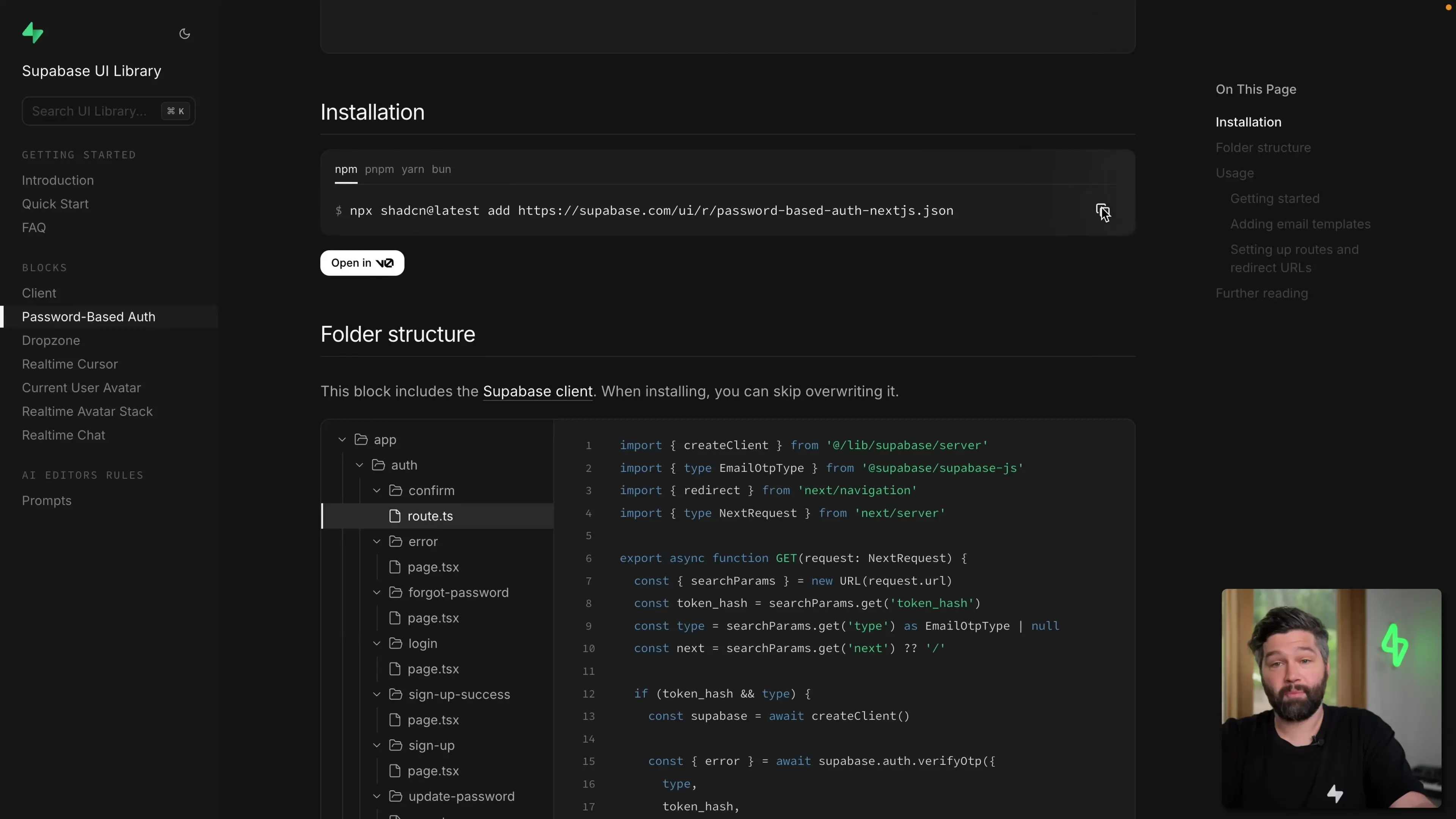
Testing the Authentication Flow
With the Superbase UI Library installed and connected to our Superbase project, we now have a complete authentication flow. When you visit your application, you'll be automatically redirected to the sign-in page.
Since you don't have an account yet, click on "Sign up" and enter your email and password. You'll receive an email to confirm your account. After confirming, you can log in with your credentials.
Once logged in, you'll be redirected to a protected page that displays a welcome message with your name. This page is only accessible to authenticated users.
Customizing the Protected Page
The protected page is fully customizable. Let's modify it to display more information about the authenticated user:
export default function ProtectedPage() {
  const supabase = createClient();
  const { data, error } = useUser();

  if (error || !data) {
    redirect('/auth/login');
  }

  return (
    <div className="flex flex-col min-h-screen items-center justify-center p-24">
      <h1 className="text-2xl mb-4">Hello {data.user.email}</h1>
      <pre className="bg-gray-800 p-4 rounded">
        {JSON.stringify(data, null, 2)}
      </pre>
    </div>
  );
}This will display all the information about the authenticated user in a nicely formatted JSON object.
Adding File Upload Functionality
Another common feature in web applications is file uploading. The Superbase UI Library makes this easy with its dropzone component.
npx supabase-ui-library@latest add dropzone --forceNow, let's create a new page for our upload form. Create a new file called upload.tsx in the app directory:
import { FileUploadDemo } from "@/components/upload-form";

export default function UploadPage() {
  return (
    <div className="flex min-h-screen flex-col items-center justify-between p-24">
      <main className="flex flex-col items-center justify-between">
        <FileUploadDemo />
      </main>
    </div>
  );
}You'll also need to create the upload-form.tsx file in the components directory. The Superbase UI Library provides a complete implementation that you can copy from the documentation.
Benefits of Using the Superbase UI Library
- Rapid development: Implement complex features like authentication and file uploads with minimal code
- Fully customizable: All component code lives in your codebase, making it easy to modify
- Built on Shadcn: Inherits beautiful styling and accessibility features
- Seamless Superbase integration: Components are designed to work directly with Superbase services
- Works with any React framework: Compatible with Next.js, Remix, React Router, and more
Conclusion
The Superbase UI Library, built on top of Shadcn components, provides a powerful way to quickly implement common features in your React applications. With just a few commands, you can add complete authentication flows and file upload functionality that are fully customizable and beautifully styled.
Whether you're building with Next.js, Remix, React Router, or any other React-based framework, this UI library can significantly speed up your development process while maintaining high-quality user experiences and accessibility standards.
Let's Watch!
Build React Apps Faster: Superbase UI Library with Shadcn Components
Ready to enhance your neural network?
Access our quantum knowledge cores and upgrade your programming abilities.
Initialize Training Sequence