Build Your Own Reusable UI Component Library in React: A Comprehensive Step-by-Step Guide
Sophia Okonkwo
Technical Writer

Creating your own UI component library is a game-changer for maintaining consistency across your React or Next.js projects. Whether you're building a small application or a large-scale design system, having reusable UI components can significantly improve your development workflow, ensure UI consistency, and speed up your development process.
In this guide, we'll walk through creating a simple yet powerful UI component library similar to popular libraries like Chakra UI or Shadcn UI. We'll focus on building components that are customizable, type-safe, and easy to use across your projects.
Setting Up Your Project
Before diving into component creation, let's set up our project. For this tutorial, we'll use React with Tailwind CSS, though the concepts apply to other frameworks like Vue or Angular as well.
Why Tailwind CSS? When building a component library, you need to decide on your styling approach. You could use vanilla CSS, CSS modules, CSS-in-JS, or Tailwind CSS. Tailwind provides a built-in design system with predefined spacing, colors, typography, and breakpoints - giving you a head start on your component library.
# If using Create React App
npx create-react-app my-component-library
cd my-component-library
npm install -D tailwindcss
npx tailwindcss init

# If using Next.js
npx create-next-app my-component-library
cd my-component-libraryCreating Your First UI Component: Button
Let's start by creating a Button component - one of the most commonly used UI elements. Our goal is to create a button that has default styling but can be easily customized when needed.
First, create a directory structure for your UI components:
mkdir -p src/ui/ButtonNow, let's create a basic Button component:
// src/ui/Button/index.tsx
import React from 'react';

export const Button = (props: React.ComponentProps<'button'>) => {
  return <button {...props} />;
};This basic component forwards all props to the HTML button element. Note that we're using TypeScript with React.ComponentProps to ensure type safety. This means our Button component will accept all the same props as a standard HTML button.
Adding Default Styles to Your Component
Now, let's add some default Tailwind CSS classes to our button:
// src/ui/Button/index.tsx
import React from 'react';
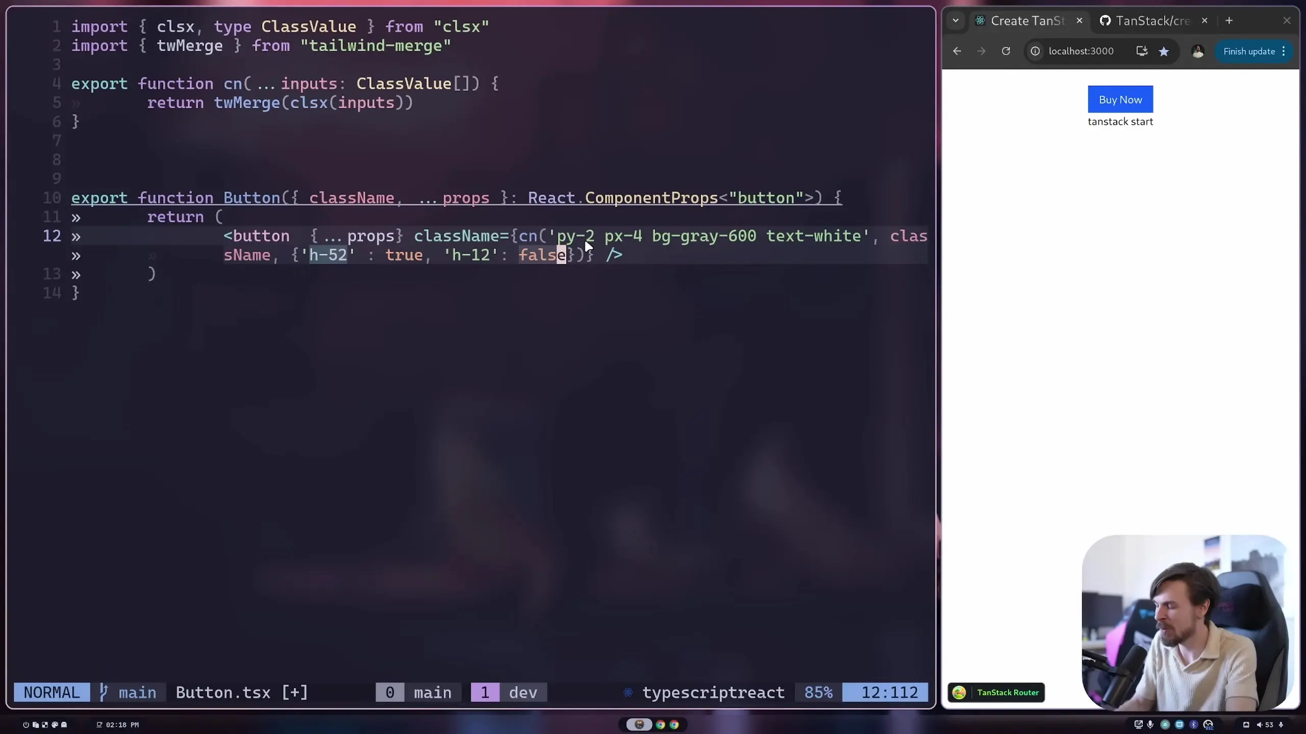
export const Button = ({ className, ...props }: React.ComponentProps<'button'>) => {
const defaultClasses = 'py-2 px-4 bg-gray-600 text-white';
return <button className={defaultClasses} {...props} />;
};However, there's a problem with this approach. If a user of our component tries to add their own className, it won't be merged with our default classes. Instead, the props spreading will overwrite our className with the user's className.
The Class Name Merging Challenge
When building UI components with Tailwind, you'll often face the challenge of merging class names. You want to provide default styles but also allow users to override or extend them. This is where utilities like tailwind-merge come in handy.
First, install tailwind-merge:
npm install tailwind-mergeNow, let's update our Button component to use tailwind-merge:
// src/ui/Button/index.tsx
import React from 'react';
import { twMerge } from 'tailwind-merge';

export const Button = ({ className, ...props }: React.ComponentProps<'button'>) => {
  const defaultClasses = 'py-2 px-4 bg-gray-600 text-white';

  return <button className={twMerge(defaultClasses, className)} {...props} />;
};With tailwind-merge, when there are conflicting class names (like two different background colors), the last one takes precedence. This allows users to override specific styles while keeping the rest of the default styles.
Using Your Button Component
Now that we have our Button component set up, let's see how it can be used in an application:
// src/App.tsx
import React from 'react';
import { Button } from './ui/Button';

function App() {
  return (
    <div className="p-4">
      <h1 className="text-2xl font-bold mb-4">My UI Component Library</h1>

      {/* Default button */}
      <Button>Default Button</Button>

      {/* Customized button */}
      <Button className="mt-4 bg-blue-600 hover:bg-blue-700 rounded-full">
        Customized Button
      </Button>
    </div>
  );
}

export default App;Notice how in the second button, we're able to override the background color to blue and add additional styles like hover effects and rounded corners, while still keeping the default padding and text color.
Adding Variants to Your Components
A professional UI component library typically offers different variants of components. Let's add primary, secondary, and outline variants to our Button component:
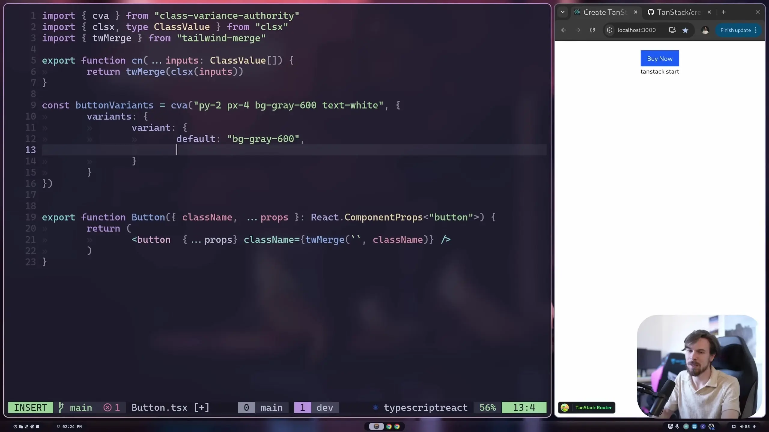
// src/ui/Button/index.tsx
import React from 'react';
import { twMerge } from 'tailwind-merge';

type ButtonVariant = 'primary' | 'secondary' | 'outline';

interface ButtonProps extends React.ComponentProps<'button'> {
  variant?: ButtonVariant;
}

export const Button = ({ className, variant = 'primary', ...props }: ButtonProps) => {
  // Base classes all buttons share
  const baseClasses = 'py-2 px-4 rounded font-medium transition-colors';

  // Variant-specific classes
  const variantClasses = {
    primary: 'bg-blue-600 text-white hover:bg-blue-700',
    secondary: 'bg-gray-600 text-white hover:bg-gray-700',
    outline: 'bg-transparent border border-blue-600 text-blue-600 hover:bg-blue-50'
  };

  return (
    <button
      className={twMerge(baseClasses, variantClasses[variant], className)}
      {...props}
    />
  );
};Now users can specify a variant when using the Button component:
<Button variant="primary">Primary Button</Button>
<Button variant="secondary">Secondary Button</Button>
<Button variant="outline">Outline Button</Button>Using clsx for Conditional Classes
For more complex conditional class logic, you might want to use the clsx (or classnames) library alongside tailwind-merge. This is particularly useful when you have classes that should be applied based on certain conditions.
npm install clsxHere's how you can use clsx with tailwind-merge:
// src/ui/Button/index.tsx
import React from 'react';
import { twMerge } from 'tailwind-merge';
import clsx from 'clsx';

interface ButtonProps extends React.ComponentProps<'button'> {
  variant?: 'primary' | 'secondary' | 'outline';
  size?: 'sm' | 'md' | 'lg';
  isFullWidth?: boolean;
}

export const Button = ({
  className,
  variant = 'primary',
  size = 'md',
  isFullWidth = false,
  ...props
}: ButtonProps) => {
  const baseClasses = 'rounded font-medium transition-colors';

  const classes = twMerge(
    baseClasses,
    // Variant classes
    clsx({
      'bg-blue-600 text-white hover:bg-blue-700': variant === 'primary',
      'bg-gray-600 text-white hover:bg-gray-700': variant === 'secondary',
      'bg-transparent border border-blue-600 text-blue-600 hover:bg-blue-50': variant === 'outline'
    }),
    // Size classes
    clsx({
      'py-1 px-2 text-sm': size === 'sm',
      'py-2 px-4 text-base': size === 'md',
      'py-3 px-6 text-lg': size === 'lg'
    }),
    // Width class
    clsx({
      'w-full': isFullWidth
    }),
    // User's custom classes
    className
  );

  return <button className={classes} {...props} />;
};Expanding Your Component Library
Using the same principles we've covered, you can build out a complete UI component library. Here are some common components you might want to add:
- Input fields and form elements
- Cards and containers
- Navigation components
- Modals and dialogs
- Dropdowns and select menus
- Tabs and accordions
- Alerts and notifications
Best Practices for UI Component Libraries
- Maintain consistent prop naming across components
- Document your components thoroughly with examples
- Ensure components are accessible (follow WAI-ARIA practices)
- Test your components for various use cases
- Keep your component API as simple as possible
- Allow for customization without sacrificing usability
- Consider creating a Storybook to showcase your components
Conclusion
Building your own UI component library gives you complete control over your application's design system and ensures consistency across your projects. With the techniques covered in this guide—prop forwarding, class name merging with tailwind-merge, and conditional styling with clsx—you have the foundation to create a robust and flexible component library.
Remember that a good component library evolves over time. Start with the basic components you need most frequently, and expand as your project requirements grow. By following the patterns outlined in this guide, you'll be able to create UI components that are both beautiful and functional.
Let's Watch!
Build Your Own UI Component Library in React: A Step-by-Step Guide
Ready to enhance your neural network?
Access our quantum knowledge cores and upgrade your programming abilities.
Initialize Training Sequence